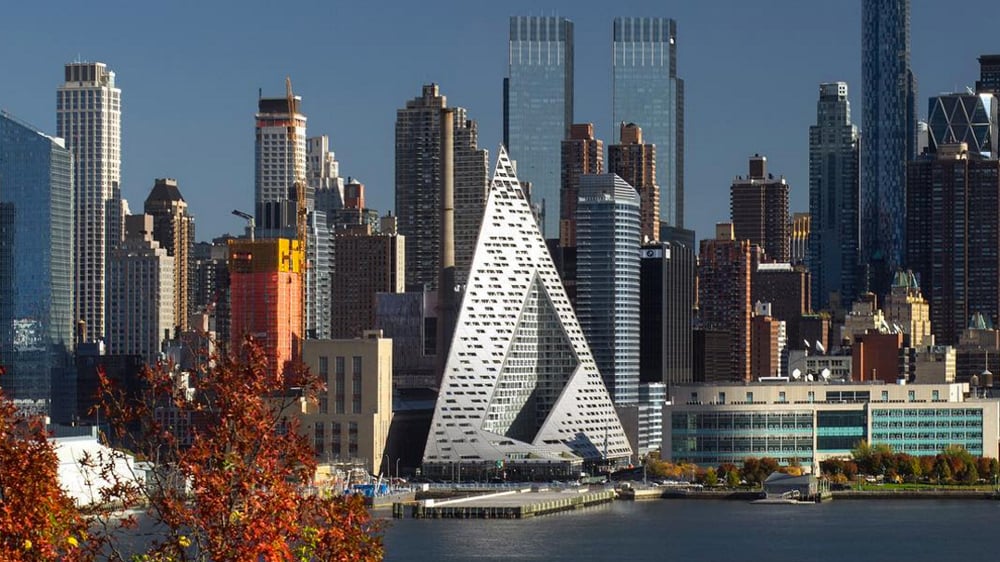
It’s a hot topic these days. There is a lot of conversation on the web about commercial storefront architecture and the newest, most modern New York architects storefronts. There are also a lot of conversations and view points on the preservation of historical storefronts. So, who is winning? Is it more important to preserve our historical shopping, or to move into the future with new & modern commercial architecture, as we do with fashion?
The storefront is the most important commercial architectural element
We all know that the most important architectural feature of a commercial building is the storefront. This is where the potential consumers’ attention will first be grabbed. The storefront is the customer’s first glimpse into the ‘eye of the store’ and what it beholds inside. The traditional glass storefront is also a beacon of all of the goodies waiting for us voyeurs to buy. That voyeurism, that fundamental sexiness so essential to shopping, is what makes city streets full of glass storefronts so exciting. Can that same level of sexiness come across in the renovated storefronts as well as it seems to in the new modern ones?
Modern commercial architects must ‘brand’ with their storefront designs
In today’s modern storefront design, commercial architects have been tasked with branding the company through architecture. This can be tricky. To be successful, the architectural engineer must enhance the prestige of the brand by retail design, and at the same time consider customer needs and public expectations. When they are successful the results can elegantly and instantly raise the brand’s profile and even transform the shopping experience of neighboring stores. A few great examples of this are the Prada Store in Tokyo, and the Manhattan Apple Store. Take a look around you, the ones that are successful have created really unique, cool, interesting designs that make you WANT to go into the store, no matter what they are selling…or at the very least, they make you stop what you are doing and take a long look.
Historical designs differentiate from one-size-fits all storefronts
But what about the value of historical yesteryear storefront designs? The revitalization of some downtown shopping districts across America has been one of the great success stories of the past decade. Preservation, renovation – and sometimes re-creation – of traditional commercial storefront architecture has played a strong part in this revival. Everywhere the mistakes of the 1950s and 1960s are being removed and the original Victorian and early 20th century storefronts restored or re-created. Research has shown that “re-establishing the older commercial look and feel creates a unique sense of place that differentiates the area from the contemporary, one-size-fits-all commercial architecture of malls across America. High end shoppers have demonstrated a distinct preference for commercial districts that possess a unique historical and architectural identity.”*
Old vs. new – storefronts will always be critical
So who wins out, the old or the new? Will we be giving up our architectural nostalgia for the newer, sleeker, more interesting designs? Or can they go up side by side in harmony, so everyone is happy? No matter which way our future storefront architecture goes, it will always remain the most important feature of commercial buildings, (for the commercial architects and designers, for the consumers, and for the store’s brand) playing its ever crucial role in advertising and merchandising strategy.

More Stories
Job Opportunities in Luxembourg: A Gateway to International Careers
What Types of Injuries Do Queens No-Fault Doctors Treat Most Often?
Difference Between Workers’ Comp Doctors and Regular Physicians in Rego Park